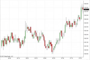
Traders frequently use a form of charting known as candlestick charting to display price information about a security. Candlestick charting was originally invented in the mid 19th century by Japanese rice traders, and has subsequently been adopted in modified form by most traders the world over. A candlestick chart has time on the X axis, divided up into periods. The conventional Japanese candlestick chart used a 1-day period, but any period of time works reasonably well. In general the period should be long enough so that multiple trades execute. Here is a candlestick chart of the S&P index future (symbol ES) with a 1-minute time period:
 As you can see, for each minute there’s a “candle”, possibly with a “wick” above and/or below it. Each candle, or bar, conveys 5 pieces of information: opening price, closing price, highest price, lowest price, and direction of price movement. The top and bottom of the body of the candle are opening and closing price – the color of the candle tells you which is which. In this chart a green candle means the bar closed higher than it opened. A red candle means it closed lower. The wicks represent the highest and lowest prices seen. If the close was at a high or low, there is no wick on that side.
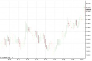
There’s an interesting visual implication here – that prices rejected by the market (highs or lows outside the open-close body) in some sense aren’t as meaningful as prices that are accepted. This assumption is questionable. One of the criticisms of candlestick charting is that if you changed the time scale or the place where the bars break (perhaps, in the case of minute bars, breaking at X:30 instead of at X:00), things that were wicks would sometimes become bodies and vice versa. This isn’t of as much concern when the candle break corresponds to a trading halt, as it does with candles on a daily or weekly timeframe. But on shorter time frames the meaning of body vs. wick is not necessarily clear. That said, many traders still use candles even on shorter time frames. As an alternative, one can use a chart style known as OHLC bars (for Open High Low Close) which makes the “wicks” the same thickness as the body. Here’s the same chart with OHLC bars:
 I personally prefer candlestick charts even when there is no trading halt between candles because I find them easier on the eyes. But either works fine.